Dec 6, 2015

Mom's leek and potato soup

Mom's recipe card
As the weather chilled, I wanted a comforting soup, and what could be better than Mom's creamy leek and potato soup? I still have her recipe card, and it warms my heart to use it. When I told the women in the family what I was making, they wanted the recipe too -- in her handwriting. So I copied the card and glued the recipe to fresh index cards, which I sealed with matte medium. They love having the recipe, and -- even more -- this dear memento of Mom, in her own script.


Mom's Leek and Potato Soup


3 to 4 cups peeled potatoes, sliced or diced
3 cups thinly sliced leeks, mostly white part
1 1/2 quarts homemade chicken broth (canned is OK)
1/3 cup heavy cream
2 to 3 T. soft butter
2 to 3 tsp. minced parsley

Simmer vegetables and broth together, partially covered, until vegetables are very tender. Mash the potatoes with a fork.  (I use an immersible blender.) Season with salt and pepper. Set aside, uncovered, until ready to serve.

Reheat to simmer just before serving, then add cream and butter. (You can skip cream and butter, but it will taste different.) Heat -- do not boil. Decorate with parsley.

*Before mashing vegetables, cook until you think it is the right consistency. If too liquid, cook it down before mashing.

Nov 29, 2015

Flower Series 6: Success??


Bright flowers
12" x 12"
acrylic
I planned a series of quilts inspired by flowers, mandalas and the Brazilian artist Beatriz Milhazes. Months later I have a stack of acrylic paintings. One is a mandala, all have flowers, and  I see Milhazes in their layers and colors. My niece Gretchen got me started painting a pineapple for her. Since then I've painted on cotton, drew with stitch, and collaged with fabric and paint. But there is no series as planned.

Instead, I'm on a discovery trail and loving it. 
  1. For inspiration, give me flowers -- they are more than mere petals and stems!
  2. And give me paint to mess with. Yesterday I read about an artist who paints with his fingers, wearing plastic gloves. I'm more of a natural mess; I love my fingers all gooey with colors. (Paintbrushes also have a place. ) For me, precision is in the feel of the finished piece, not perfection according to plan. I must discover a way to make messy quilts, with undefined edges 
  3. For now  I'll skip "meaningful" (or political) work. The world is such a tumble, but direct defiance is not my best response. (Embracing causes has not worked for me,  in either religion or journalism. Or art.)
  4. I'm going to continue painting and sewing and looking and loving. Flowers and paint are not the end. They are leading me somewhere.


Nov 21, 2015

Crust for Thanksgiving pies


Pie crust is tricky. That's what Mom said. And a flaky crust is the mark of a good cook. She said that too. I've used lots of recipes, including Mom's, and have to admit mine is not always as flaky as I'd like. My current favorite recipe is from Bon Appetit. I love that it says to work the dough with your hands! You could also use a food processor or a fork, I guess.

The Flakiest, Butteriest Crust

1 cup + 2 T. chilled unsalted butter
2 1/4 C. flour
1 T. sugar
1 tsp. kosher salt
1 T. apple cider vinegar
3 T. water

1. Cut butter into 1" pieces. Chill it while you measure the dry ingredients.
2. Mix the flour, sugar and salt together in a big bowl. I use that bowl you see in the photo above.
3. Add the butter and toss it until it's coated with flour. Then use your fingers and palms to work the butter into small, irregular pieces. This is fun. Stop before the butter gets warm. You should still see some pieces of butter.
4. Mix the vinegar with the ice water.
5. Drizzle the liquid over the flour-butter mixture. Mix it up quickly with your hands so the dough kind of sticks together. It will still seem pretty dry.
6. Turn the dough onto a piece of waxed paper (no extra flour needed) and knead it a few times. Don't let the butter get all mixed in. The idea is to keep some butter in discreet pieces.
7. Push the dough down and cut it in half. Press each half down to about an inch high, and wrap the two pieces in plastic wrap and chill in refrigerator 1 hour to 3 days. (OK, I'm doing a few more than three! Let's see -- Thanksgiving's four days from tomorrow. In a day or two I'll:
8. Roll it out and fit into pie pan.
9. Blind bake or fill and bake according to recipe.

I'll be making this pumpkin pie Thursday morning.  You could do worse!

Nov 14, 2015

Sweet, squiggly hanging heart: How-to

Yours will look better! This is old and well-loved. It guards my fabric cupboard.

Here are directions I made for friends at Sew Arty. We are sharing ideas for quilted gifts.

1. Draw a heart on stiff paper.
2. Cut it out.
3. Find a quilt scrap.
4. Trace heart on it. Cut it out.
5. Repeat for a backing.
6. Sew the two hearts together, right sides out. Stop, leaving room to stuff.
7. Stuff the heart with loose batting. Finish seam.
8. With wire, make a loop between the two heart lobes, slipping wire through your stitches, then twist to secure.
9. Squiggle a longer piece of wire decoratively and end with a hook for hanging. Make sure wire is strong enough to hold the heart without sagging. Squeeze the ends of wire so they are not sharp.


Sep 23, 2015

Flower series 5: Happy heart

Happy heart
32" x 36"
paint and stitch
I love Happy Heart!
Of course, there was a moment when I wanted to throw her away (her??) That happens.
I like how my original small flowered heart transforms dramatically when enlarged. I copied the original onto a transparency and enlarged it. using the overhead projector that Maureen so kindly insisted I keep. (Sure does come in handy, Maureen! Thank you!)
I drew the lines in pencil on white Kona cotton, lightly so the pencil wouldn't show on the finished piece.
Then I sewed over the lines with black thread, using free-motion stitching. It was miserable! Even if I blasted light on the piece, I could barely see the lines. Then I used Mark-B-Gone, with trepidation. It's as blue as this quilt! It's hard to believe the color will wash out with cold water. I tested it first. Still I worried my piece would be ruined by blue. Probably everyone who uses the stuff feels the same way at first.
Before quilt-drawing I layered the Kona with felt and white duck. (Yes, purists, I confess I used spray adhesive. I love it!) The thing is, that felt is wool. I love wool felt.
After  the design was all stitched in black -- my machine was like a drawing tool -- I held my breath and ran cold water over the piece. I held it over the bathtub, and in a flash the blue ran down the drain. I sighed big time! 
Alas, too soon! 
Did you know that wool felt shrinks in a second?? 
My quilt was all scrunched up. Lots of people do this on purpose, but I did it by accident. Suddenly my quilt was very QUILTY. The design was bumpy, thanks to shrinkage. I was sad. 
Then I was happy. I love it the texture!
After that, painting.
This, too, was a delight. I expected to be bored to death, coloring within the lines of my flowers. But it was peaceful and fun.
It helped that I had made a dozen preliminary drawings, mixing paint and then trying out this and that combination. 
It still needs at least stitching around the edges. Maybe a simple facing. 
But I have a happy heart.


** Series note: You are right, Ellen! veering from guidelines is the definition of art. My series is far from what I'd envisioned. It turns out I'm exploring paint-related quilting techniques, doing what's fun rather than following the rules I'd set for myself. It's still about flowers, quilting, and color, with Beatriz Milhazes as my distant teacher. A series, it turns out, can be exploration. Boundaries are for leaping.

detail
Happy Heart

Sep 3, 2015

Series 4: veering from plan


Seduced by paint,  I have detoured from my plan to make a series of quilts. A couple of months ago, dazzled by my own sense of organization, I outlined what I wanted to make (Yes, I did want to!), then created a few flower paintings to warm up for the floral quilts. And never quit. There's paint on my pants and on my hands, and dripped on the floor too.

I haven't abandoned flowers. I thought they'd get to be a bore, but instead found that forever isn't long enough to absorb floral color and variety and life.

Flowers are in. Color is in. I've stuck to that much of my series plan. Stripes and mandalas are on hold. I'm spending lots of time painting (The colors, when I mix them, turn into other colors!) I'm making a glorious mess.

Thanks to Google and a visit last month to the Quilt National exhibit in Athens, Ohio, I have been able to observe how others combine paint with quilting. I'm now "drawing" on fabric using black thread and free-motion quilting, then painting inside the designs: flowers, for now.

This may be a series of sorts, based on the gorgeousness of flowers and fabric. And paint.


Jul 26, 2015

Life of Poet James Merrill

James Merrill: Life and ArtJames Merrill: Life and Art by Langdon Hammer
My rating: 2 of 5 stars

I wanted to like it, but no.
I wanted to like him, but no to that too. Not Merrill's fault, but his biographer's.
This is a recitation of faces (family, lovers, students)  and places (the mansions of childhood, followed by Amherst College, Athens, Stonington, Madison, WI, California ...) and all the while a growing body of poems. Sterile, bloodless. Not Merrill, and maybe not all his poems, either. Just this book. It's a record, no doubt helpful but I like some life when reading a life.


View all my reviews

Flower series 2: Painting orchids


Wild Orchids
16" x 12"
Paint on cotton, quilted


Detail, Wild Orchids


How I made it:

  1. Sketchbook drawing. Inspired by orchid in my window. I drew the flowers and leaves onto white Kona cotton then painted them, thought it too boring, so painted black lines and shapes freehand. (11' x 14")
  2. Drew it onto white Kona cotton. Black fabric marker. (11" x 16")
  3. Painted with fabric paints. They seeped through. Wondered if Gesso would make fabric less absorbent.
  4. Painted over white and green areas with acrylic paints. 
  5. Layered over thin white felt.
  6. Free-motion quilted along drawing lines. Black thread. You can't really see the quilting, but it adds depth. Decided not to use rayon thread. Too shiny.  
  7. Tried adding machine quilting detail to an orchid. Didn't like it -- not subtle. ed Ripped it out.
  8. Sew a couple of rows of stitching around edges, using straight stitch. Black thread.
  9. Attached to Timtex painted black around the edges.  Timex is about 1" bigger than orchids. Mystifuse
  10. Add a piece of muslin over the back. Before attaching, put Fray-check on the edges of the muslin and attach a rod pocket and a label.  Mistyfuse adhesive.


Jul 22, 2015

Flower series 1: Paint, print, stitch -- stop!


I am not ready.

Not ready to make the series of quilts that I planned a month or so ago: square, precise, Milhazes-inspired mandala-like flowers and stripes in vibrant colors. (Sounds pretty, doesn't it?)

After many false starts, a few paintings, and 2 quilt-ish pieces, I have learned:

  • I can't do precise. I like messy, or shall we say irregular?
  • I seem to prefer square-ish to square.
  • I don't like to do intensive thread painting. For example, below, I copied my painting Roses onto cotton and then adhered it to stable cotton duck. Ideally, I would cover the surface with stitch to mimic the paint colors. But no! I just don't enjoy it.


... and on the positive side, I learned:

  • I lean toward an intuitive, even spiritual,  method, not necessarily the mandala style I'd planned.
  • I love working on a single subject, in this case flowers. My pop-around brain benefits from focus. There is no end to what flowers can teach me of color, line, shape, mood, etc., etc.
  • I love layering.
  • I love colors. 
  • I love stripes, even precise ones. (One of my hero-artists is stripe master Bridget Riley.)
  • Most fun for me has been painting. I thought I was painting to become a better quilter, but I love painting for itself.

My style emerges.

For my next "series" I'm going to paint flowers freely, and experiment with painting on cotton, linen, and silk and combine that with stitch.

In addition to recording progress online, I'm taking notes the crazy way I did in graduate school: big and messy, sometimes upside down --  sitting on the floor and writing/drawing with colored markers on a newsprint pad. One page or more per project, no other rules.

It works for me!

Notes so far


Jul 1, 2015

Walking backward to a series

I have taken many steps in my series project -- most of them backward.
First, I pinned my plan to the design wall. The plan taunts me. It seems I've picked exactly what I cannot bring myself to do: inspired by Beatriz Milhazes, I have set out to make precise, geometry-inspired designs in square format, with palette and imagery based on Florida nature.

For my first piece, I picked a drawing in my (rectangular, 11" x 14") sketchbook. It is a watercolor, based on a sketch of flowers against the window blinds in my studio.


The blinds would work as stripes, which Milhazes uses so effectively.

 I traced the image, rearranging the blossoms just a bit. I went to Staples and enlarged and also minimized the flowers. I made tracings of these, then played with them on my design wall, where I had pinned a striped 19" x 19" square for my base. I rearranged them over and over, many times, many days, including just  before I went to bed and as soon as I got up. I added a vase, put stars on the stamens, and took a few photos when something seemed close to good. What I'm looking at now is what a bird would see if he approached the flower upside down. A hummingbird, maybe. No, no! don't let me add a hummingbird!

Milhazes color copies on right, my tracings on left, and trash can handy for many rejects

I also played with the colors of blinds and grass and sky.


What I have been able to do is stick to flowers. A series is supposed to concentrate your thoughts, so give me one point. All this time, I've been drawing and painting flowers, real and make-believe, exact and abstract.


It's not that I adore flowers (I like chocolate and butterflies and bridges better.), but flowers are teaching me so much about everything else: color and line and shadow and impact. I'm afraid I'm also learning I love messy edges and incomplete thoughts. Precision, as in Milhazes' art, drives me wild. Not when I look at it, but when I make it.


But it's true I learned how to cook intuitively by first following many recipes; and I trust my series project will give me the same kind of good grounding. I have the feeling that once I start cutting fabric, the series might practically make itself. I can hope.

Jun 20, 2015

Painting flowers, preparing for quilt

I painted the flowers with my fingers and the stems with a brush. I printed the table.
This is kind of like the "Happy" quilt I made a while ago.

I've been painting flowers, kind of free-form. I love the mess that paint makes, and the way colors and shapes emerge without planning. I tell myself this is to get ready to make flowers in my upcoming quilt series. ... but I'm not sure ... I love the fluidity of paint, and may have trouble transferring that to fabric and stitch.  We'll see.

Jun 13, 2015

Mandala of flower pieces

12" x 12"
Sea grape, , native azalea, orchid pieces

The center is a  small sea grape leaf; it's surrounded by paint dots, then dancing pieces of native azalea -- in bloom they are dazzling -- sadly, their color has faded into brown swirls.  Last comes petals of old orchids. Then more gold and bronze shiny paint. 


Jun 10, 2015

Series: focusing the heart

I'm close to starting a series. It took ages to settle on a theme and a few characteristics to unite all the pieces. Thanks to Elizabeth Barton's Visual Guide to Working in a Series, the preliminary thinking has been fun -- it's learning to choose what I love.  I recommend this to you if you want to get deeper into whatever you are making -- it could be cantatas (Bach did it!) or ice cream (Jeni in Columbus, Ohio, is a master).

Series will feature Florida nature
Palm tree, Melbourne, FL (photo)
Here's my art series plan:
I'm going make mandala-inspired pieces -- 
all square 
several small ones and at least one large -- size to be decided soon. Maybe ( 20" x 20" or 25" x 25")  and then 36" x 36" or bigger.  
Pairs may have similar design but different value structure. (Not sure if I'm up to this one -- I may try this after making several simpler pieces.) 

I will look to Beatriz Milhazes for inspiration. I love her layering and her concentrated palette and spirit and the way she conveys it through flowers, geometry and abstraction. My palette will be different, and I'm trying to grasp the spirit of Florida. 

 sketchbook
Beatriz Milhazes
preparing a series
They will have flowers -- one big one each? 

wild red flower by our mailbox
Also:  poinciana blossoms and that pink flower from Coconut Grove -- flowers I love already.  Possibly stripes. Black and white, for starters:

Orchid in sketchbook (acrylic)
What I like so far about this plan:
Lets me work with intuition (choices of shape and color)
Flowers
Curves and swirls
Layering
May include quilting, embroidery, words, paint, print
May include nature-inspired imagery -- butterflies, swirls, leaves, dragonflies, circles, and maybe hearts, if that's not too sappy. Pointy grasses and palm trees
and cypress roots. Birds. Fish. 

Although I'm referencing mandala, the quilts don't have to be circular or symmetrical. And  -- maybe because mandalas are spirit-based -- they may free me, and also those who see them. 


Jun 8, 2015

Cape Coral

Rig's house in Cape Coral. I added the colors.

May 29, 2015

Art Series

I'm no baseball fan, but I want to make a series. Of art quilts, that is.You could too -- come along!

I've been making one quilt at a time -- inspired by this, learning that technique, entering a competition ... I am going in a zillion directions at once!

Time to settle into a series.
My organized hero, Elizabeth Barton, in her book Elizabeth Barton's Visual Guide to Working in a Series, advises writing the answer and then pinning it up where you won't forget. Here it is -- I pinned it to my design wall:


You can see my idea is kind of lightweight. And that's perfect for me.
Then Barton says analyze the work of other artists. See what all the pieces of their series have in common, and how each differs. This goes deeper than analysis I recorded in the May 7 blog entry. (You still with me??) Think of some artists. Find series they have created. Analyze.

I love this art-thinking.

1. First Beatriz Milhazes, a world-famous Brazilian artist: Her Gold Rose series (2009) is seven silkscreen print designs -- all in boldly graphic, referencing nature through geometric shapes and bright colors. Milhazes often overlaps shapes. In this series, each piece is 31 1/2" long, but the width varies. Two of the pieces stand alone, while the others make up a diptych and a triptych.


All eight pieces in Milhazes's Summer time series have a carnival spirit, with vibrant color and -- again -- overlapping shapes. Five pieces are acrylic paintings and three are collages. Size varies; the paintings are larger than the collages -- each painting is about 100 inches in at least one dimension, while the paintings are about 50" in one dimension.


2. Many of Peter Doig's large oil paintings feature a canoe. All convey a creepy-gorgeous mood, and each one seems to tell a story that the viewer cannot comprehend. The colors are different, with one having a pink sky and blue sea,


 another a dark blue sky with a lighter blue sea.


One has a pink canoe with a persimmon sky,


and in another a white boat floats in purple, with orange beyond.


 Doig's  horizon lines differ too, and the number of figures in the boat varies. Sometimes there is a solitary figure, and in others the canoe may be empty or hold a whole group of passengers.

3. Now my favorite artist, Agnes Martin: In some ways all her paintings look alike: grid-based, pale blue, gray, and white; squiggly pencil lines, the addition of a little color here and there. Oh, and big. 6' x 6' often. I still remember the first time I saw her work in person, when the art teacher took us all to the Miami Art Museum. Those lines looked like Martin was writing from the inside out.

"I've been working on the same theme for 10 years," Martin said in the documentary of her life With My Back to the World. Also, "Beauty is the mystery of life. Beauty illustrates happiness.

Martin's Innocent Love series

is eight pieces (six shown above) very much like what I described above. They are in a chapel-like installation at the Harwood Museum in Taos, NM. When we drive out West I'm going to stop and pray there! Then I'll find out how each piece in the series differs, but it's hard to tell from the  faint lines on white of the online images.

Oh, and she diluted her paint. And she says she's not a minimalist but an expressionist painter. OK.

4. You know I also love the work of Faith Evans-Sills -- her abstraction and references to nature. I can't tell if she ever made a series, but all her online work shares a watery feel (watered down like Martin?), pale colors (especially rose and blue), with lots of white and some black too. Printing, stencils, triangles, drips, and butterflies, trees, organic shapes, flowers, birds, branches and trees are commonalities.


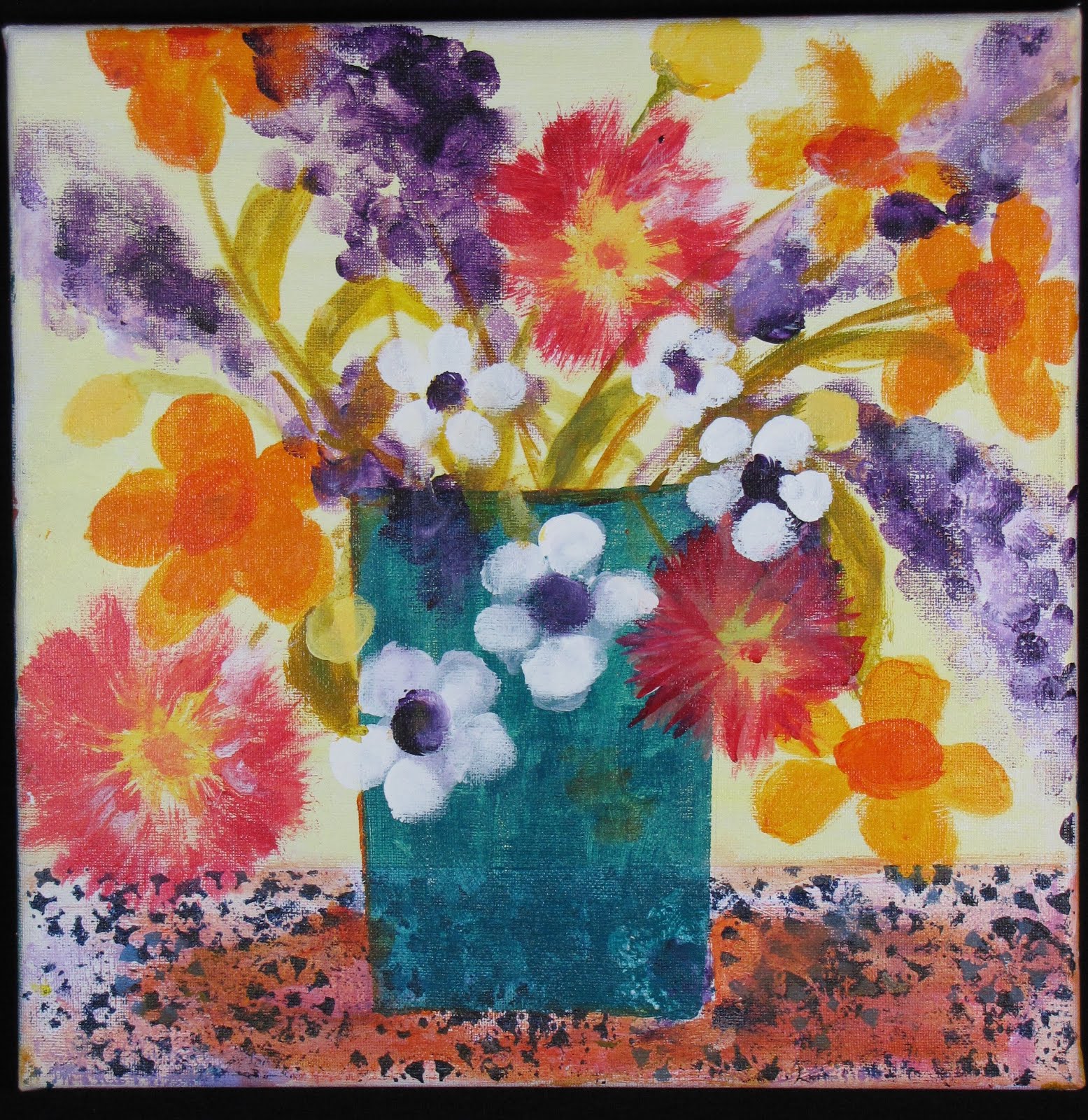
5. In order to understand color more fully, still life painter Sydney Licht limited herself to the same three colors of paint (plus black and white) for five years. That's not a series, but it is a challenge.
When she does work a series, she calls it a project. In an early one, Licht used her limited palette and posed herself a question: Can I turn an organic abstraction into a still life? In another series she painted a visual diary of her three-week stay at Yaddo. Each day she painted her lunch. In the morning she made a watercolor warm-up, and in the afternoon she work in oils.


For each series she sets herself a problem (Can I turn an organic abstraction into a still life? Can a limited palette help me understand color more fully?) then sets out to solve it. Although Licht's austere paintings don't grab me, her method does. I'm going to see how it transfers to my work. She starts with a sketchbook piece, and then fills her palette with paint. She approaches the canvas with a palette knife, putting down splotches of color, and concentrating on the negative spaces. Unlike me, Licht does not do background first. She just makes it part of the whole. I'm going to try this, using pieces of fabric and maybe some paint. With the composition thus based, she refines it with layers of paint, working until it all is "right." I can't wait to try this intuitive + figurative process!
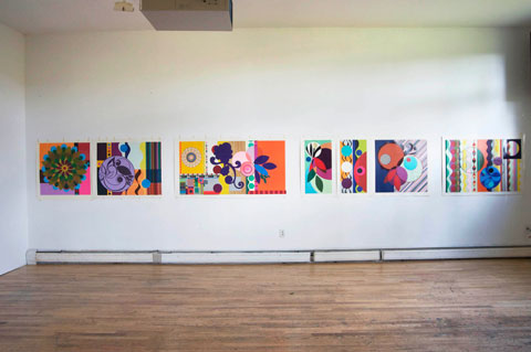
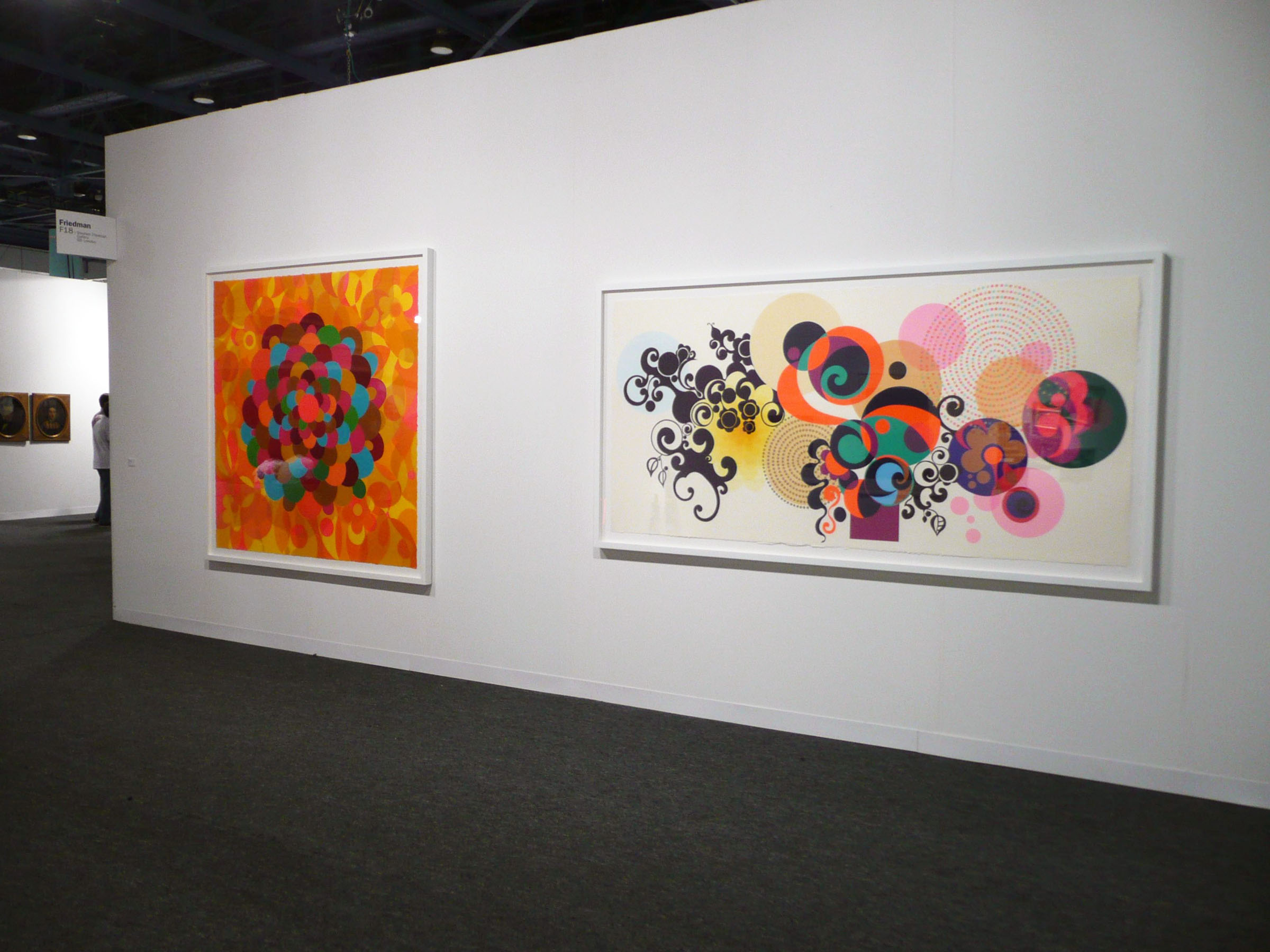

1. Beatriz Milhazes
Series: Gold Rose
common to all: seven silkscreen print designs -- all in boldly graphic, referencing nature through geometric shapes and bright colors.  All 31 1/2"  long
variations in each: two stand alone, a diptych and a triptych; width varies;

Series: Summer Time
common to all: carnival spirit, vibrant color
variations in each: five paintings, three collages; size -- paintings are bigger than collages


2. Peter Doig
Series: Canoe
common to all: creepy-gorgeous mood
variations in each: color, horizon line, number of people in canoe

3. Agnes Martin
Series: Innocent Love
common to all: eight pieces, Same size (6' x 6'?), grid-based, pale colors
variations in each: different colors and lines

4. Faith Evans-Sills -
Series:
common to all: abstraction and references to nature, similar palette
variations in each: different nature references and geometric shapes

5. Sydney Licht
Series: Lunch
common to all: Same palette. In the morning she made a watercolor warm-up, and in the afternoon she work in oils.
variations in each: Content and composition


May 7, 2015

Being myself


At nearly 70, I suddenly feel real.
I  recently took Susan Shie's great online drawing class, drawing every day in a big black book, then coloring with markers and watercolor.


Maybe that woke me up from the inside out. That, and my growing exuberant love for making things -- my art. I want to make things every which way.  To focus down, I am studying Elizabeth Barton's Visual Guide to Working in a Series. It's about trying to go slow, to find subject and/or method that interests me enough to explore for a half-dozen pieces.

On p. 20 Barton says analyze theme and variation of six favorite artists.
I picked Beatriz Milhazes, whose great show I recently saw in Miami. Constants: strong color, abstractions, sharp edges, simple shapes (leaf, circle, flower), stripes, similar -- even identical -- shapes . Variations: Square or rectangle.

Joan Foster, mixed media artist. Constant: nature in muted colors. Variations in size, some have grid reference, some have tree-like shapes, some have irregular edges.

Katherine K. Allen, fiber artist. Constant: Large abstracted meditations on nature, with organic shapes and movements in a few subdued colors, paint spatters, printed leaves, dark below and airy above. Variations: Added color, cotton or silk, lowered and/or eliminated base line.

Faith Evans-Sills, mixed-media artist: Constant: dreamy botanicals and bugs that she calls a "personal map," layers, vertical watercolor swipes and drips, similar palette of clear colors (turquoise, pink, gold, orange, with black and white), black silhouettes, verticals in background. Variations: Some have triangles, some have shapes of simple buildings, some have more black and white.

Poet Marie Howe: Constant: Blank verse that is intimate, with scrupulous detail looking at life as it goes, referencing her brother John, who died of AIDS at 28. Abrupt, clarifying ends. Dark. Variations: Time changes from childhood memories to John's death and then afterward.

Then I chose several favorite poems:
Tanka by Claribel Alegria
Be helpless, dumbfounded by Rumi
The Second Coming by William Butler Yeats
It's the dream by Olav H. Hague
The Mystery, a Celtic rune
Songs, an Inuit incantation
Ask Me by William Stafford
Constants include blank verse, incantatory, dreamy feel, referencing water and air (through fish, sea, dream, current, harbor, breeze, stillness, bubble, gyre), a kind of epiphany. Variations: Rune, song, Told in first person, second person, or third person.
Our back steps

Apr 11, 2015

Eyes wide open: faces in my sketchbook


V is my favorite letter; you can see it in my drawings.


Blog Archive

About Me

My photo
I love to make things.