I've been making one quilt at a time -- inspired by this, learning that technique, entering a competition ... I am going in a zillion directions at once!
Time to settle into a series.
My organized hero, Elizabeth Barton, in her book Elizabeth Barton's Visual Guide to Working in a Series, advises writing the answer and then pinning it up where you won't forget. Here it is -- I pinned it to my design wall:

You can see my idea is kind of lightweight. And that's perfect for me.
Then Barton says analyze the work of other artists. See what all the pieces of their series have in common, and how each differs. This goes deeper than analysis I recorded in the May 7 blog entry. (You still with me??) Think of some artists. Find series they have created. Analyze.
I love this art-thinking.
1. First Beatriz Milhazes, a world-famous Brazilian artist: Her Gold Rose series (2009) is seven silkscreen print designs -- all in boldly graphic, referencing nature through geometric shapes and bright colors. Milhazes often overlaps shapes. In this series, each piece is 31 1/2" long, but the width varies. Two of the pieces stand alone, while the others make up a diptych and a triptych.
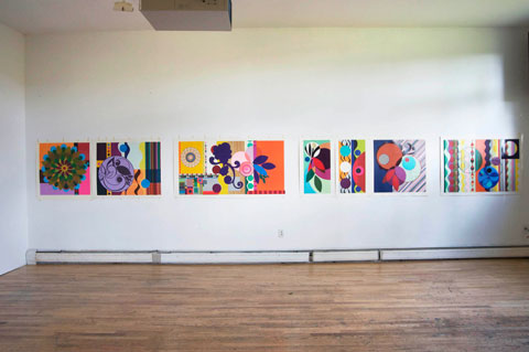
1. First Beatriz Milhazes, a world-famous Brazilian artist: Her Gold Rose series (2009) is seven silkscreen print designs -- all in boldly graphic, referencing nature through geometric shapes and bright colors. Milhazes often overlaps shapes. In this series, each piece is 31 1/2" long, but the width varies. Two of the pieces stand alone, while the others make up a diptych and a triptych.
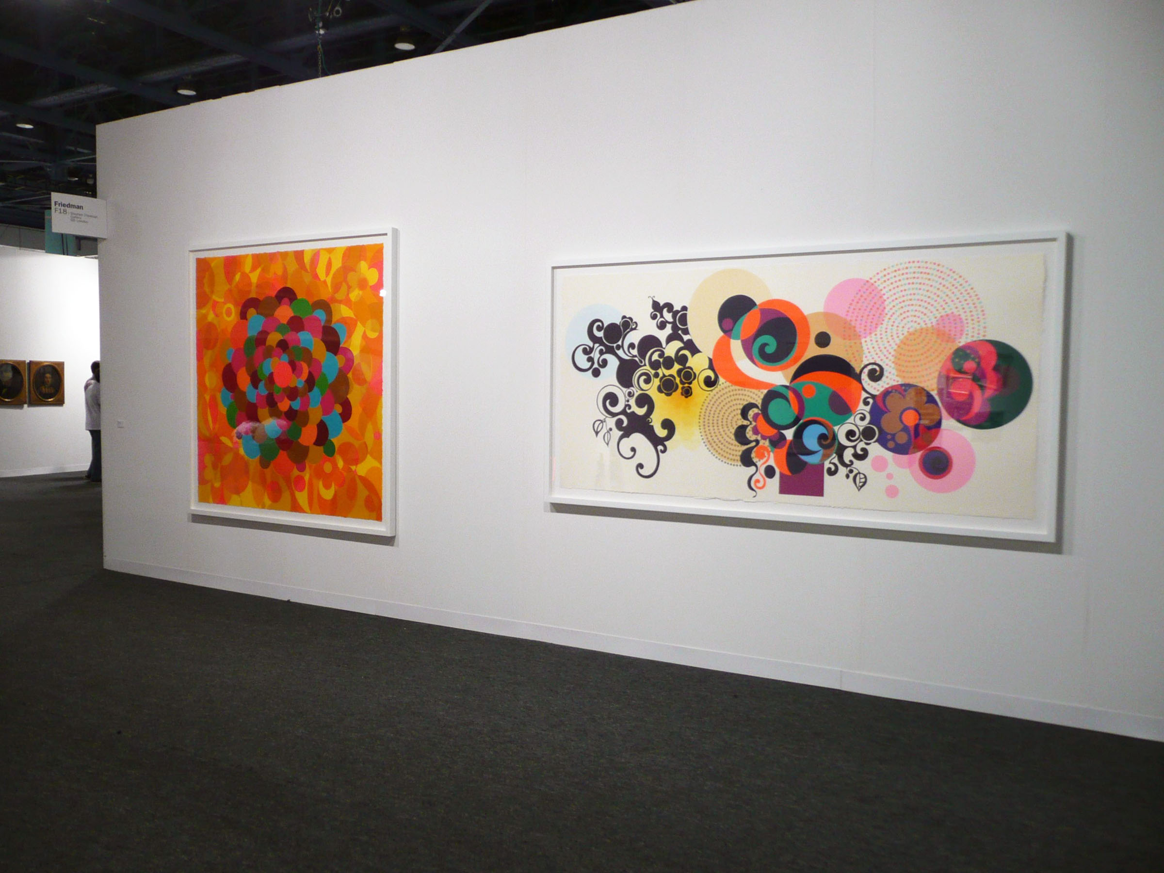
All eight pieces in Milhazes's Summer time series have a carnival spirit, with vibrant color and -- again -- overlapping shapes. Five pieces are acrylic paintings and three are collages. Size varies; the paintings are larger than the collages -- each painting is about 100 inches in at least one dimension, while the paintings are about 50" in one dimension.
2. Many of Peter Doig's large oil paintings feature a canoe. All convey a creepy-gorgeous mood, and each one seems to tell a story that the viewer cannot comprehend. The colors are different, with one having a pink sky and blue sea,

another a dark blue sky with a lighter blue sea.

One has a pink canoe with a persimmon sky,

and in another a white boat floats in purple, with orange beyond.

Doig's horizon lines differ too, and the number of figures in the boat varies. Sometimes there is a solitary figure, and in others the canoe may be empty or hold a whole group of passengers.
3. Now my favorite artist, Agnes Martin: In some ways all her paintings look alike: grid-based, pale blue, gray, and white; squiggly pencil lines, the addition of a little color here and there. Oh, and big. 6' x 6' often. I still remember the first time I saw her work in person, when the art teacher took us all to the Miami Art Museum. Those lines looked like Martin was writing from the inside out.
"I've been working on the same theme for 10 years," Martin said in the documentary of her life With My Back to the World. Also, "Beauty is the mystery of life. Beauty illustrates happiness.
Martin's Innocent Love series
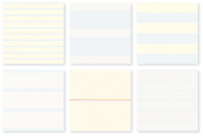
is eight pieces (six shown above) very much like what I described above. They are in a chapel-like installation at the Harwood Museum in Taos, NM. When we drive out West I'm going to stop and pray there! Then I'll find out how each piece in the series differs, but it's hard to tell from the faint lines on white of the online images.
Oh, and she diluted her paint. And she says she's not a minimalist but an expressionist painter. OK.
4. You know I also love the work of Faith Evans-Sills -- her abstraction and references to nature. I can't tell if she ever made a series, but all her online work shares a watery feel (watered down like Martin?), pale colors (especially rose and blue), with lots of white and some black too. Printing, stencils, triangles, drips, and butterflies, trees, organic shapes, flowers, birds, branches and trees are commonalities.

5. In order to understand color more fully, still life painter Sydney Licht limited herself to the same three colors of paint (plus black and white) for five years. That's not a series, but it is a challenge.
When she does work a series, she calls it a project. In an early one, Licht used her limited palette and posed herself a question: Can I turn an organic abstraction into a still life? In another series she painted a visual diary of her three-week stay at Yaddo. Each day she painted her lunch. In the morning she made a watercolor warm-up, and in the afternoon she work in oils.

For each series she sets herself a problem (Can I turn an organic abstraction into a still life? Can a limited palette help me understand color more fully?) then sets out to solve it. Although Licht's austere paintings don't grab me, her method does. I'm going to see how it transfers to my work. She starts with a sketchbook piece, and then fills her palette with paint. She approaches the canvas with a palette knife, putting down splotches of color, and concentrating on the negative spaces. Unlike me, Licht does not do background first. She just makes it part of the whole. I'm going to try this, using pieces of fabric and maybe some paint. With the composition thus based, she refines it with layers of paint, working until it all is "right." I can't wait to try this intuitive + figurative process!
1. Beatriz Milhazes
Series: Gold Rose
common to all: seven silkscreen print designs -- all in boldly graphic, referencing nature through geometric shapes and bright colors. All 31 1/2" long
variations in each: two stand alone, a diptych and a triptych; width varies;
Series: Summer Time
common to all: carnival spirit, vibrant color
variations in each: five paintings, three collages; size -- paintings are bigger than collages
2. Peter Doig
Series: Canoe
common to all: creepy-gorgeous mood
variations in each: color, horizon line, number of people in canoe

another a dark blue sky with a lighter blue sea.

One has a pink canoe with a persimmon sky,

and in another a white boat floats in purple, with orange beyond.

Doig's horizon lines differ too, and the number of figures in the boat varies. Sometimes there is a solitary figure, and in others the canoe may be empty or hold a whole group of passengers.
3. Now my favorite artist, Agnes Martin: In some ways all her paintings look alike: grid-based, pale blue, gray, and white; squiggly pencil lines, the addition of a little color here and there. Oh, and big. 6' x 6' often. I still remember the first time I saw her work in person, when the art teacher took us all to the Miami Art Museum. Those lines looked like Martin was writing from the inside out.
"I've been working on the same theme for 10 years," Martin said in the documentary of her life With My Back to the World. Also, "Beauty is the mystery of life. Beauty illustrates happiness.
Martin's Innocent Love series
is eight pieces (six shown above) very much like what I described above. They are in a chapel-like installation at the Harwood Museum in Taos, NM. When we drive out West I'm going to stop and pray there! Then I'll find out how each piece in the series differs, but it's hard to tell from the faint lines on white of the online images.
Oh, and she diluted her paint. And she says she's not a minimalist but an expressionist painter. OK.
4. You know I also love the work of Faith Evans-Sills -- her abstraction and references to nature. I can't tell if she ever made a series, but all her online work shares a watery feel (watered down like Martin?), pale colors (especially rose and blue), with lots of white and some black too. Printing, stencils, triangles, drips, and butterflies, trees, organic shapes, flowers, birds, branches and trees are commonalities.
5. In order to understand color more fully, still life painter Sydney Licht limited herself to the same three colors of paint (plus black and white) for five years. That's not a series, but it is a challenge.
When she does work a series, she calls it a project. In an early one, Licht used her limited palette and posed herself a question: Can I turn an organic abstraction into a still life? In another series she painted a visual diary of her three-week stay at Yaddo. Each day she painted her lunch. In the morning she made a watercolor warm-up, and in the afternoon she work in oils.

For each series she sets herself a problem (Can I turn an organic abstraction into a still life? Can a limited palette help me understand color more fully?) then sets out to solve it. Although Licht's austere paintings don't grab me, her method does. I'm going to see how it transfers to my work. She starts with a sketchbook piece, and then fills her palette with paint. She approaches the canvas with a palette knife, putting down splotches of color, and concentrating on the negative spaces. Unlike me, Licht does not do background first. She just makes it part of the whole. I'm going to try this, using pieces of fabric and maybe some paint. With the composition thus based, she refines it with layers of paint, working until it all is "right." I can't wait to try this intuitive + figurative process!
1. Beatriz Milhazes
Series: Gold Rose
common to all: seven silkscreen print designs -- all in boldly graphic, referencing nature through geometric shapes and bright colors. All 31 1/2" long
variations in each: two stand alone, a diptych and a triptych; width varies;
Series: Summer Time
common to all: carnival spirit, vibrant color
variations in each: five paintings, three collages; size -- paintings are bigger than collages
2. Peter Doig
Series: Canoe
common to all: creepy-gorgeous mood
variations in each: color, horizon line, number of people in canoe
3. Agnes Martin
Series: Innocent Love
common to all: eight pieces, Same size (6' x 6'?), grid-based, pale colors
variations in each: different colors and lines
4. Faith Evans-Sills -
Series:
common to all: abstraction and references to nature, similar palette
variations in each: different nature references and geometric shapes
common to all: eight pieces, Same size (6' x 6'?), grid-based, pale colors
variations in each: different colors and lines
4. Faith Evans-Sills -
Series:
common to all: abstraction and references to nature, similar palette
variations in each: different nature references and geometric shapes
5. Sydney Licht
Series: Lunch
common to all: Same palette. In the morning she made a watercolor warm-up, and in the afternoon she work in oils.
variations in each: Content and composition
common to all: Same palette. In the morning she made a watercolor warm-up, and in the afternoon she work in oils.
variations in each: Content and composition


