Showing posts with label printing. Show all posts

Jun 23, 2020

Did you ever think of painting with an onion?

This spring I took two of EstĂ© MacLeod's online watercolor classes. Not only is she a delightful artist, she is an effective online teacher, and I recommend her classes.  These notes are for me, and they might inspire you as well. I want to remember what I learned -- many techniques apply to acrylic and other media as well as watercolor.

1. Wet on wet


Paint
Nickel Azo Yellow -- vibrant and transparent
Hansa Yellow -- opaque, so good for final details
Paynes Grey for shading under the fruit.


  1. Draw a berry lightly if you like. Eventually skip this step.
  2. Use a pointed mop brush to create a watery form. Sop up some water with paper towel. Avoid the areas where leaves will go.
  3. Apply paint, red and yellows t, to see how they react with one another.
  4. You can also print a strawberry shape, even using a berry cut in half.
  5. Add leaves.


2. Handwriting and dip pen to create texture and shape 

Pineapple


Qunacridone gold deep and yellow ochre


  1. Write the word pineapple or some other words to create the texture of a pineapple. Connect all the letters in rows that are close together. You can write sideways too. 
  2. Use a dip pen with watercolor diluted with water. 


3. Pattern, masking, & printing with an onion!

Wet Paper
Stamping with Q-tip, TP roll, green onions!
Masking Fluid

Ultramarine, Pthalo blue, Paynes gray
fan and dagger brushes

Stamp with paint shapes in rows, Use vegetables, q-tips, 
Stamp with masking fluid
Dry completely.
Paint on top. 
Remove masking fluid when the paint on top of it is dry. 
Also, paint lines of water on the paper, leave for a few minutes so it gets absorbed. Dab paint on. Watch the paint flow.
When masking fluid is removed you can add more paint to the white parts.


Numbers inspire leaves and plants

4. Positive and negative shapes


Carbon copy paper for texture
  1. Write the numbers 1 to 9
  2. Turn the numbers into simple leaves, bigger than an inch. 
  3. Pick out favorites.
  4. Draw these again on a piece of paper. 
  5. Put the carbon paper face down on sketchbook and go ver the outlines of the leaves so there is a template of shapes in the sketchbook.
  6. Duplicate these shapes and cut them out.
  7. Arrange on blank page into a symmetrical plant shape. No overlapping!
  8. Place carbon paper on top of the plant shape laid out in separate paper forms. 
  9. Create a texture to cover the entire area. Can use your nails, pencil, stone, wood, fork...
  10. Lift carbon paper and stencil to reveal plant shape. 
  11. Paint the textured background.
  12. Create a stencil on one piece of paper to be used as a negative and positive shape.

5. Printed Wreath


Printing with potatoes, latex sponge

Yellows, viridian green, pthalo blue, paynes gray, red for accent
Mop brush

  1. Draw a light circle, using dinner plate.
  2. Print  a wreath of leaves clockwise. Use the leaf shapes cut into potatoes. 
  3. Apply paint to potatoes with a mop brush.
  4. Build up color: start with light colors and gradually add more layers.
  5. Mask sections that will be printed over. 
  6. Add details with designs painted onto a sponge, or paint directly onto the paper. May use dip pen.


6. Roundup: Tree of Life 

I didn't do this one yet...
Use some of the above techniques to create a tree. 
Keep it simple and then develop further. 
Draw in sketchbook for starters. 
Also may mix white acrylic High Flow with Paynes Gray, brown and a bit of red (for soft gray color) to create an opaque gouache.

#explorecolour


May 29, 2015

Art Series

I'm no baseball fan, but I want to make a series. Of art quilts, that is.You could too -- come along!

I've been making one quilt at a time -- inspired by this, learning that technique, entering a competition ... I am going in a zillion directions at once!

Time to settle into a series.
My organized hero, Elizabeth Barton, in her book Elizabeth Barton's Visual Guide to Working in a Series, advises writing the answer and then pinning it up where you won't forget. Here it is -- I pinned it to my design wall:


You can see my idea is kind of lightweight. And that's perfect for me.
Then Barton says analyze the work of other artists. See what all the pieces of their series have in common, and how each differs. This goes deeper than analysis I recorded in the May 7 blog entry. (You still with me??) Think of some artists. Find series they have created. Analyze.

I love this art-thinking.

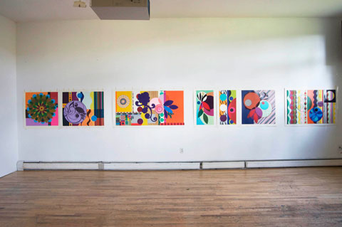
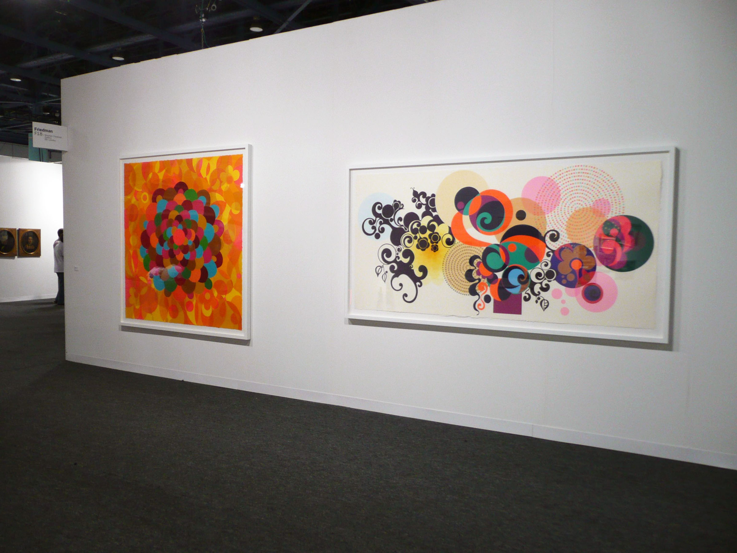
1. First Beatriz Milhazes, a world-famous Brazilian artist: Her Gold Rose series (2009) is seven silkscreen print designs -- all in boldly graphic, referencing nature through geometric shapes and bright colors. Milhazes often overlaps shapes. In this series, each piece is 31 1/2" long, but the width varies. Two of the pieces stand alone, while the others make up a diptych and a triptych.


All eight pieces in Milhazes's Summer time series have a carnival spirit, with vibrant color and -- again -- overlapping shapes. Five pieces are acrylic paintings and three are collages. Size varies; the paintings are larger than the collages -- each painting is about 100 inches in at least one dimension, while the paintings are about 50" in one dimension.


2. Many of Peter Doig's large oil paintings feature a canoe. All convey a creepy-gorgeous mood, and each one seems to tell a story that the viewer cannot comprehend. The colors are different, with one having a pink sky and blue sea,


 another a dark blue sky with a lighter blue sea.


One has a pink canoe with a persimmon sky,


and in another a white boat floats in purple, with orange beyond.


 Doig's  horizon lines differ too, and the number of figures in the boat varies. Sometimes there is a solitary figure, and in others the canoe may be empty or hold a whole group of passengers.

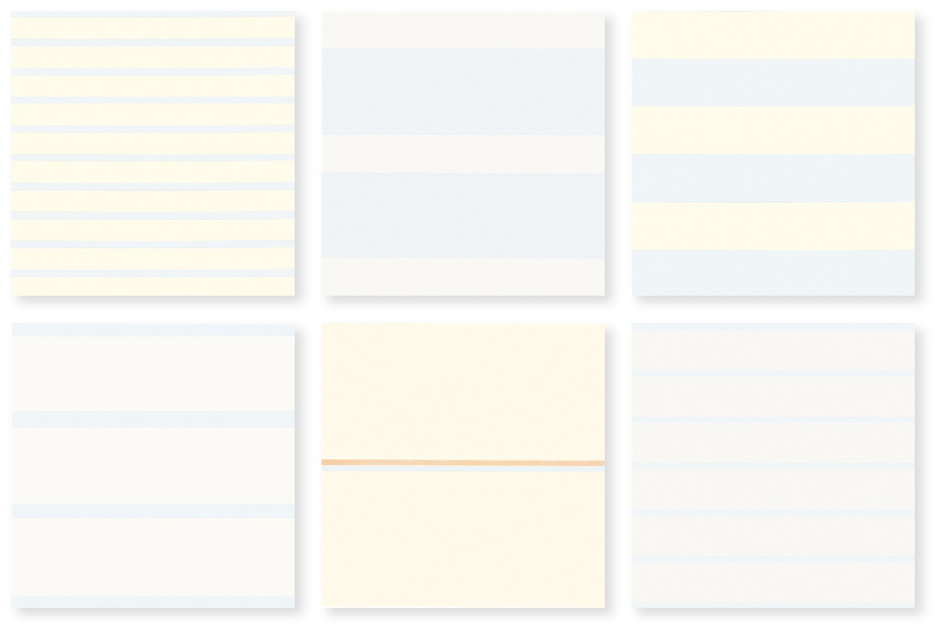
3. Now my favorite artist, Agnes Martin: In some ways all her paintings look alike: grid-based, pale blue, gray, and white; squiggly pencil lines, the addition of a little color here and there. Oh, and big. 6' x 6' often. I still remember the first time I saw her work in person, when the art teacher took us all to the Miami Art Museum. Those lines looked like Martin was writing from the inside out.

"I've been working on the same theme for 10 years," Martin said in the documentary of her life With My Back to the World. Also, "Beauty is the mystery of life. Beauty illustrates happiness.

Martin's Innocent Love series

is eight pieces (six shown above) very much like what I described above. They are in a chapel-like installation at the Harwood Museum in Taos, NM. When we drive out West I'm going to stop and pray there! Then I'll find out how each piece in the series differs, but it's hard to tell from the  faint lines on white of the online images.

Oh, and she diluted her paint. And she says she's not a minimalist but an expressionist painter. OK.

4. You know I also love the work of Faith Evans-Sills -- her abstraction and references to nature. I can't tell if she ever made a series, but all her online work shares a watery feel (watered down like Martin?), pale colors (especially rose and blue), with lots of white and some black too. Printing, stencils, triangles, drips, and butterflies, trees, organic shapes, flowers, birds, branches and trees are commonalities.


5. In order to understand color more fully, still life painter Sydney Licht limited herself to the same three colors of paint (plus black and white) for five years. That's not a series, but it is a challenge.
When she does work a series, she calls it a project. In an early one, Licht used her limited palette and posed herself a question: Can I turn an organic abstraction into a still life? In another series she painted a visual diary of her three-week stay at Yaddo. Each day she painted her lunch. In the morning she made a watercolor warm-up, and in the afternoon she work in oils.


For each series she sets herself a problem (Can I turn an organic abstraction into a still life? Can a limited palette help me understand color more fully?) then sets out to solve it. Although Licht's austere paintings don't grab me, her method does. I'm going to see how it transfers to my work. She starts with a sketchbook piece, and then fills her palette with paint. She approaches the canvas with a palette knife, putting down splotches of color, and concentrating on the negative spaces. Unlike me, Licht does not do background first. She just makes it part of the whole. I'm going to try this, using pieces of fabric and maybe some paint. With the composition thus based, she refines it with layers of paint, working until it all is "right." I can't wait to try this intuitive + figurative process!


1. Beatriz Milhazes
Series: Gold Rose
common to all: seven silkscreen print designs -- all in boldly graphic, referencing nature through geometric shapes and bright colors.  All 31 1/2"  long
variations in each: two stand alone, a diptych and a triptych; width varies;

Series: Summer Time
common to all: carnival spirit, vibrant color
variations in each: five paintings, three collages; size -- paintings are bigger than collages


2. Peter Doig
Series: Canoe
common to all: creepy-gorgeous mood
variations in each: color, horizon line, number of people in canoe

3. Agnes Martin
Series: Innocent Love
common to all: eight pieces, Same size (6' x 6'?), grid-based, pale colors
variations in each: different colors and lines

4. Faith Evans-Sills -
Series:
common to all: abstraction and references to nature, similar palette
variations in each: different nature references and geometric shapes

5. Sydney Licht
Series: Lunch
common to all: Same palette. In the morning she made a watercolor warm-up, and in the afternoon she work in oils.
variations in each: Content and composition


Mar 17, 2014

Tape and glue: image transfer with artist Julie Guyot

Applying packing tape to an image
Here's what I learned at Tuesday's Visual Journaling class with artist Julie Guyot at the Thomasville Center for the Arts in Georgia.
There are many ways to transfer an image -- make it go from a picture on paper to some other medium, such as paper ... or wood ... or fabric... Here are two methods Julie demonstrated. When I got home I tried them, and you can see my results at the bottom.

Tape transfer method
Julie recommends 3M brand packing tape. Lower-quality tape makes the image transfer  less detailed, less complete. Julie says clear contact paper also works. 

Here are her steps: Saturate the picture in water and then gently scrape the paper off. You should end up with a picture on your tape.
Glue it to your base.
Simple! I think I get it:
1. Put tape on top of your picture.
2. Soak it in water so the picture paper kind of disintegrates.
3. Rub the paper off the tape: voilá! The ink sticks to the tape.

Right now I am having lunch and when I finish I'm going to try this. Of course, I have to stifle the obvious: Why am I doing this, anyway?
To make layers. If it works (really, I'm wondering ... ) If it works, I can put this picture on top of another image, and parts of that picture will show through the empty parts.

Soaking tape-covered picture in water

Acrylic medium method

 Use gel medium. Julie used Golden brand heavy gel. Brush it on all one way.
Brushing medium onto the image
Dry until all the tacky feeling is gone (as little as 15 minutes, but preferably overnight). 
Brush another layer of sticky stuff, going in the other direction..
Dry.
Soak. Rub it gently so the paper comes off. Again, the ink is supposed to stick to the top. You have in effect made your own packing tape with a picture on it. There are various types of medium. You can choose shiny or matte surface. 
Rubbing the paper off


In her fourth class Julie also discussed adding text to your art. Basically, write with whatever you want, whatever you can; in choosing text, consider its scale, size, style.  Options include pen and ink, paint, printing. You can use maps, letters, recipes, songs, music, poetry ... 


OK, now here's my first attempt. What didn't work for me may very well be a triumph for you.


3M tape ended up blank. That's the nearly-clear tape, and below it a mess of paper I rubbed off.
I was impatient.

 Great oak tree soaking
I brushed on two layers Mod Podge, because I read in the website below that it works like the Golden medium But it didn't
This tree turned into paper scraps

I kind of like these trees
I used Golden medium

See that texture at top right?
It's the paper I was rolling off the hardened medium

Here are two that "worked"
The little one is a sunset

Here's a website I consulted on how to make photo transfer with gel medium: 

http://stacyalexander.blogspot.com/2008/02/how-to-make-photo-transfer-for-collage.html


Dec 28, 2013

Present at the creation -- of a book


Teresa sent me this link, knowing I'd want to share. I've shuddered in front of printing presses so big and noisy that they shook the building, but watching this makes me realize publication can also be simple, tactile and aesthetically satisfying: an art. Thanks, Teresa!

Nov 13, 2013

Collage on watercolor paper


What is it I like about this collage? I made it on watercolor paper, following the blog Simply Artistic Pleasures; I used masking, spray paint, calligraphy pens, painted gesso, printing tools. It looks kind of messy and happy. Maybe I like it because there are no mistakes.

Lately I've been overwhelmed by how much I don't know about art -- theory, history, technique. I am reading too much about the high-stakes multi-national art scene. How ridiculous to let that craziness infest my thinking.

Finally I realize the obvious: make lots of art, learn along the way, and enjoy every moment. That's why I like this collage.


Mar 19, 2013

Writing on stone

A couple of weekends back I attended a collage workshop with Amanda Wilke at LeMoyne. She taught us how to do lithography. I don't see much future in it for me. But whenever I say that, sometime hence there you'll find me, immersed in what I first rejected. So I paid attention to Amanda.
After she showed us, we did it ourselves.

Once I took a printing class -- for an entire semester I studied ... well ... something about making magazines and newspapers out of paper and ideas. Some info I stored;  most I shed. But I do remember that lithography means writing on stone. OK, now you've got me, Amanda. Can't do that with my iPad! Amanda assured me there are no stones involved. Any flat surface will do, so long as you can put greasy ink on top of it. The greasy ink prints, while the rest of the surface, being kind of wet, rejects the ink. That's the general idea of lithography, isn't it, Mr. Gutenberg? Oh, that's not your thing, Mr. G? Listen to Amanda then:


Lithography (Wear gloves)


Materials: glass, oil paint, gum Arabic (art supply store or order a big one from Graphic Chemical online), stand oil (I forget where you buy that -- probably an art store.)

1.    Find a high-contrast image.
2.    Make a copy of the image on a printer that is not ink-jet.


3.    Brush gum Arabic over the image.

4.    Sponge off the gum Arabic. Be gentle so it doesn't tear.


5.    Mix oil paint with stand oil to get it runny enough to coat the brayer. This is not always necessary. It depends on conditions, such as temperature and humidity. Your oil paint might work all by itself.
6.    Spread the ink on a piece of glass that has tape around the edges so you don't cut yourself. And "work" it until it is right for the brayer.
7.    Ink the brayer.

8.    Put your copied image on glass


9.  Lightly roll the brayer over the image.


10. Put the blank paper (or fabric) on top of the image. Roll with brayer.
11.    Sponge the image.
            12. Remove from glass.

Am I missing a step? There's only one way I'll find out -- by doing lithography on my own -- soon.


May 3, 2010

Printing 3 – Block Prints

I thought it would be like in school – stamping "Good Work" on the top of students' papers. But no.
I used Jacquard Textile Color #104 Pink, a water-based acrylic paint. I sponged it onto the stamp with a sponge paintbrush. You can also use a makeup sponge. I couldn't wait to use the wood stamps that I bought at The British Museum a long time ago. As you can see in the details of the birds, you've got to have exactly the right amount of paint or else it will ooze around the fine details. When you're finished, you scrub the stamp with a toothbrush. These practice stamps are in my notebook. Next: cotton sateen, using blocks that I make. Ideas are in The Painted Quilt by Linda & Laura Kemshall, & A Little Creative Space.


Apr 26, 2010

Printing 2 – Rubbings


Rubbings are easy. You can see from my materials that I was remembering grade school, when we rubbed a crayon sideways over autumn leaves. This technique is a bit more grown-up, but no harder. I used thin, paper-covered wire from the floral section of the craft store. It's easy to shape. Here's what to do:

1. Twist the wire into a simple shape. You will find yourself looking at everything to see if it can be worked into wire. I chose a glass, a pear, fish, & finally realized I can write with wire.


2. Put the wire shape under your surface, either notebook or fabric. Don't turn your crayon sideways, like we did in grade school. Instead, let the crayon feel its way along the wire line that's underneath. Use your other hand to kind of guide it by pressing down ahead of where you're working. You will get a jumpy image. For paper, use a pastel crayon, & for fabric use Paintstiks. I did these pears on paper that I'd previously watercolored.


Apr 20, 2010

Printing 1 – Stencils


I want to write on fabric, & have to learn some techniques first, so I signed up for a printing class at LeMoyne, but it was canceled. I decided to work by myself, using The Painted Quilt as a guide. I wrote a schedule for one technique a week, & listed the materials needed. I have to be finished by Sunday night. Stenciling was first.

Stenciling
The materials are pictured below, & at the top is my first stencil art. You need a notebook, some freezer paper from the grocery, & pastels. That was an art mystery. Turns out they're oily crayons. I used cheap (about $5) fabric crayons from DickBlick.
  1. Find something beautiful & simple. From my collection of dried leaves I chose a sea grape. In the book they use flower petals right off the bush.
  2. Fold a piece of freezer paper in half, shiny sides together, & iron to make it double thick.
  3. Trace around the leaf onto freezer paper.
  4. Cut it out. First I used a small scissors, then one of those pointy art knives.
  5. Rub a thick line of pastel around the edge of the shape. You can use more than one color.
  6. Put the shape (stencil) over the page where you want it.
  7. Rub the color inward toward the empty space. Use a toothbrush or your fingers. I used a toothbrush.
  8. Repeat. Try overlapping. Make a new stencil for each color. Don't move the stencil as you work. Clean your brushes. (I haven't; they look hopeless.)
Later I watercolored some pages before stenciling. This is a good way to envision how fabrics will look. Pretty, too. This was fun. Next: rubbings. You need wire & Paintstiks.


Blog Archive

About Me

My photo
I love to make things.