Showing posts with label collage. Show all posts

Feb 3, 2019

Must Valentines be red?

Written last night:
Dear Friends,
I’m sitting in the easy chair in the kitchen — one of my favorite spaces. It’s cold (51°) and slightly windy here, but probably colder and windier where you are.  Siri says Columbus, Ohio, will get a high of 53° on Tuesday, dipping soon after to a low of 19°. 

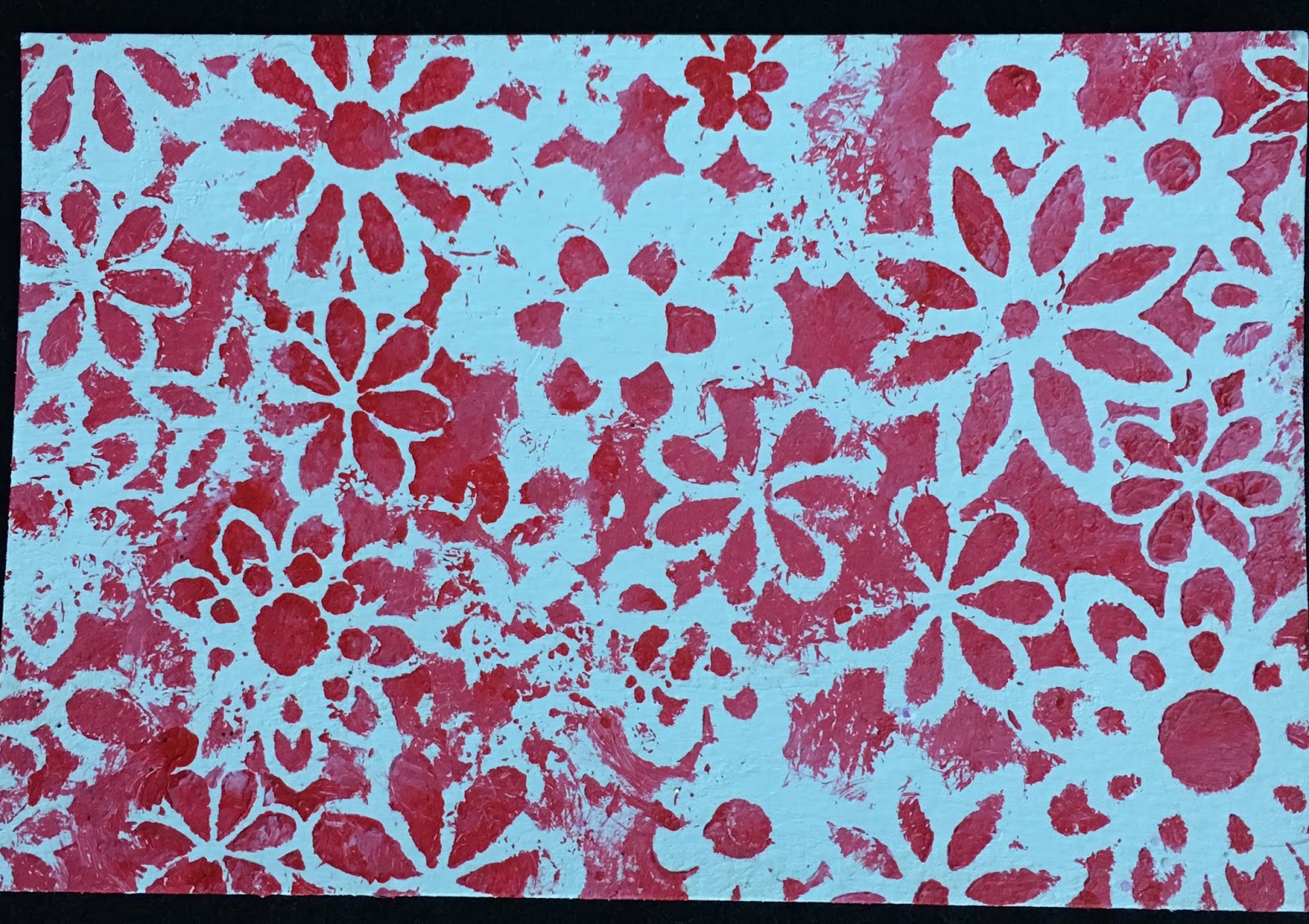
It was a peaceful day — All I did (mostly) was make hearts — not exactly Valentines, but kind of. I painted gold and turquoise and even black, and I love them all, but it made me realize that Valentines are red and white, just like Christmas is red and green. Can’t mess with it, but I tried. Here are some. They are postcard size, 4” x 6”.

Love,
k


Sep 27, 2018

Apples to apples

Written last night:
Dear Friends,
Today I finished that book about habits (The Power of Habit by Charles Duhigg); I read it because these past two years have made me realize how crucial routines are. Basically the book said we do things because they give us a reward. So to establish a routine we have to make sure we get a reward. Simple, huh? And he wrote a whole book about it.

I finished the apple collage this afternoon, except for a final coat of varnish and a frame. I like it, even though it’s not as smooth as the under-painting. Good art is supposed to look wonderful from a distance, and then be interesting when you get up close too. Collage is ready-made for that, since you only see the details of small pieces up close. I’m going to make a few more collages and also paint a simple apple, as Mary suggests. Thanks, Mary.

Love,
k
The collage, above
The underpainting, below


Sep 18, 2018

Step !: Collage workshop

Dear Friends,
At 7:15 this morning Zing! went to Tony’s, and I went to a collage workshop led by Elizabeth St. Hilaire. She lives in Orlando and I learned about her when I lived in Florida. Her collages are bright and happy. So I was surprised that she’s leading a workshop in northern California. 


We painted an apple ahead of class time. In the workshop we are going to paint paper, then tear it, then glue it onto a canvas-covered board to make a collage of that apple. Today I learned various ways to use print and stencil and paint. By 4 p.m. I was tired. I guess that means I’m learning something. Here is my first step: the painted apple.

Love,
k


Nov 7, 2017

Slow mail sends a message

Written last night:

Dear Friends,

Did you ever hear of “mail art”? 
Really, now, do you even use mail much? 
You know I love speedy tech communication, but I also love to send postcards that I’ve designed, maybe even sewn, to friends and family. It takes time, but it’s fun for me, and I get to think of the recipient all the while.
Yesterday the Crocker Museum had a class in mail art, and I took it. Here’s a postcard I made, using papers and letters cut from magazines. It was fun.

Love,
k


Jun 15, 2017

Inspired by Beatriz Milhazes

12" x 12"
Acrylic collage on canvas board


This piece is inspired by Brazilian artist Beatriz Milhazes.  Her collage + paint technique and vibrant colors and design enchanted Patrice and me when we saw her work at the Perez Museum in Miami. I was experimenting with her methods and trying to see if they work on fabric right when Clark died. After that I stopped. Now I've picked up the project, using 12" x 12" canvas board instead of cotton. It is easier to work with.

1. Draw designs on plastic.

2. Paint the design. I used heavy body paint, Liquitex Cerulean Blue Hue. I let the paint dry overnight.
I painted the canvas board beneath it in Liquitex Brilliant yellow-green.

3. Brush Elmer's glue on the back of the designs.
Place the painted plastic, glue side down, on the base.
I put bricks on top. 
Let it dry. When dry, gently pull the plastic off. Some of the paint might come off as well, creating a weathered look.

Make more designs the same way. 
Let the paint dry.
Cut the designs out when the paint is dry.
I made simple fish in Liquitex Prussian Blue Hue and a red-orange curved piece (Liquitex Naphthol crimson + Turner's Yellow.)

Experiment with placement of the designs.
When it looks good, glue them down. Let the glue dry.
When the glue is dry, pull the plastic off and leave the designs.
I could add more layers of design and color, using the same technique, but I have challenged myself to make one small piece each week, using a different inspiration every time.

Jun 9, 2017

Where the art things are

Written last night:
Dear Friends,

Today this collage is close to finished. 
It's my first actual project since Clark died. I loved making it and in the process I learned where  all my art things are! 

Love,
k


First the chill, then the sun
silk,  gold leaf,watercolor and acrylic paint
on canvas panel
12" x 12"

Jun 2, 2017

First the chill, then the sun

Written last night:

Dear Friends,

This morning I had to make a routine call. 
“Welcome to the Internal Revenue Service.” 
Can you imagine the chill those words create? 
Of course you can.

Anyway, that’s how my day began — with a chilled heart. But the call was indeed routine, and the woman (Hudson was her last name — they don’t reveal their first names, she said.) was cheerful, thorough and brief. No problem. Routine.

After that everything seemed delightful.

The best thing was that I kept on making the sun collage, and I couldn’t stop. Usually after Zing and I take our last walk I go to bed, but tonight I went back to my studio and drew circles on the sun -- not exactly Picasso, but just my speed. I can’t wait to add the rays tomorrow.

Love,
k


Jul 26, 2015

Flower series 2: Painting orchids


Wild Orchids
16" x 12"
Paint on cotton, quilted


Detail, Wild Orchids


How I made it:

  1. Sketchbook drawing. Inspired by orchid in my window. I drew the flowers and leaves onto white Kona cotton then painted them, thought it too boring, so painted black lines and shapes freehand. (11' x 14")
  2. Drew it onto white Kona cotton. Black fabric marker. (11" x 16")
  3. Painted with fabric paints. They seeped through. Wondered if Gesso would make fabric less absorbent.
  4. Painted over white and green areas with acrylic paints. 
  5. Layered over thin white felt.
  6. Free-motion quilted along drawing lines. Black thread. You can't really see the quilting, but it adds depth. Decided not to use rayon thread. Too shiny.  
  7. Tried adding machine quilting detail to an orchid. Didn't like it -- not subtle. ed Ripped it out.
  8. Sew a couple of rows of stitching around edges, using straight stitch. Black thread.
  9. Attached to Timtex painted black around the edges.  Timex is about 1" bigger than orchids. Mystifuse
  10. Add a piece of muslin over the back. Before attaching, put Fray-check on the edges of the muslin and attach a rod pocket and a label.  Mistyfuse adhesive.


May 29, 2015

Art Series

I'm no baseball fan, but I want to make a series. Of art quilts, that is.You could too -- come along!

I've been making one quilt at a time -- inspired by this, learning that technique, entering a competition ... I am going in a zillion directions at once!

Time to settle into a series.
My organized hero, Elizabeth Barton, in her book Elizabeth Barton's Visual Guide to Working in a Series, advises writing the answer and then pinning it up where you won't forget. Here it is -- I pinned it to my design wall:


You can see my idea is kind of lightweight. And that's perfect for me.
Then Barton says analyze the work of other artists. See what all the pieces of their series have in common, and how each differs. This goes deeper than analysis I recorded in the May 7 blog entry. (You still with me??) Think of some artists. Find series they have created. Analyze.

I love this art-thinking.

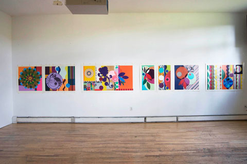
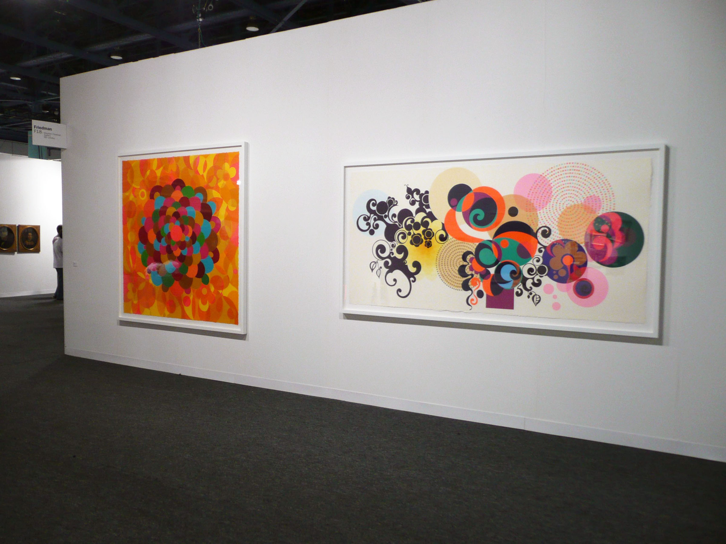
1. First Beatriz Milhazes, a world-famous Brazilian artist: Her Gold Rose series (2009) is seven silkscreen print designs -- all in boldly graphic, referencing nature through geometric shapes and bright colors. Milhazes often overlaps shapes. In this series, each piece is 31 1/2" long, but the width varies. Two of the pieces stand alone, while the others make up a diptych and a triptych.


All eight pieces in Milhazes's Summer time series have a carnival spirit, with vibrant color and -- again -- overlapping shapes. Five pieces are acrylic paintings and three are collages. Size varies; the paintings are larger than the collages -- each painting is about 100 inches in at least one dimension, while the paintings are about 50" in one dimension.


2. Many of Peter Doig's large oil paintings feature a canoe. All convey a creepy-gorgeous mood, and each one seems to tell a story that the viewer cannot comprehend. The colors are different, with one having a pink sky and blue sea,


 another a dark blue sky with a lighter blue sea.


One has a pink canoe with a persimmon sky,


and in another a white boat floats in purple, with orange beyond.


 Doig's  horizon lines differ too, and the number of figures in the boat varies. Sometimes there is a solitary figure, and in others the canoe may be empty or hold a whole group of passengers.

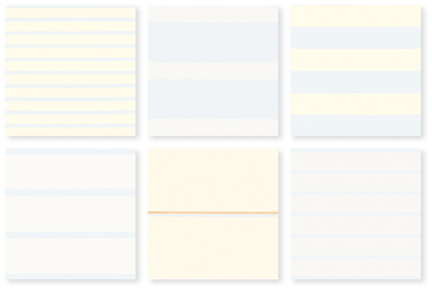
3. Now my favorite artist, Agnes Martin: In some ways all her paintings look alike: grid-based, pale blue, gray, and white; squiggly pencil lines, the addition of a little color here and there. Oh, and big. 6' x 6' often. I still remember the first time I saw her work in person, when the art teacher took us all to the Miami Art Museum. Those lines looked like Martin was writing from the inside out.

"I've been working on the same theme for 10 years," Martin said in the documentary of her life With My Back to the World. Also, "Beauty is the mystery of life. Beauty illustrates happiness.

Martin's Innocent Love series

is eight pieces (six shown above) very much like what I described above. They are in a chapel-like installation at the Harwood Museum in Taos, NM. When we drive out West I'm going to stop and pray there! Then I'll find out how each piece in the series differs, but it's hard to tell from the  faint lines on white of the online images.

Oh, and she diluted her paint. And she says she's not a minimalist but an expressionist painter. OK.

4. You know I also love the work of Faith Evans-Sills -- her abstraction and references to nature. I can't tell if she ever made a series, but all her online work shares a watery feel (watered down like Martin?), pale colors (especially rose and blue), with lots of white and some black too. Printing, stencils, triangles, drips, and butterflies, trees, organic shapes, flowers, birds, branches and trees are commonalities.


5. In order to understand color more fully, still life painter Sydney Licht limited herself to the same three colors of paint (plus black and white) for five years. That's not a series, but it is a challenge.
When she does work a series, she calls it a project. In an early one, Licht used her limited palette and posed herself a question: Can I turn an organic abstraction into a still life? In another series she painted a visual diary of her three-week stay at Yaddo. Each day she painted her lunch. In the morning she made a watercolor warm-up, and in the afternoon she work in oils.


For each series she sets herself a problem (Can I turn an organic abstraction into a still life? Can a limited palette help me understand color more fully?) then sets out to solve it. Although Licht's austere paintings don't grab me, her method does. I'm going to see how it transfers to my work. She starts with a sketchbook piece, and then fills her palette with paint. She approaches the canvas with a palette knife, putting down splotches of color, and concentrating on the negative spaces. Unlike me, Licht does not do background first. She just makes it part of the whole. I'm going to try this, using pieces of fabric and maybe some paint. With the composition thus based, she refines it with layers of paint, working until it all is "right." I can't wait to try this intuitive + figurative process!


1. Beatriz Milhazes
Series: Gold Rose
common to all: seven silkscreen print designs -- all in boldly graphic, referencing nature through geometric shapes and bright colors.  All 31 1/2"  long
variations in each: two stand alone, a diptych and a triptych; width varies;

Series: Summer Time
common to all: carnival spirit, vibrant color
variations in each: five paintings, three collages; size -- paintings are bigger than collages


2. Peter Doig
Series: Canoe
common to all: creepy-gorgeous mood
variations in each: color, horizon line, number of people in canoe

3. Agnes Martin
Series: Innocent Love
common to all: eight pieces, Same size (6' x 6'?), grid-based, pale colors
variations in each: different colors and lines

4. Faith Evans-Sills -
Series:
common to all: abstraction and references to nature, similar palette
variations in each: different nature references and geometric shapes

5. Sydney Licht
Series: Lunch
common to all: Same palette. In the morning she made a watercolor warm-up, and in the afternoon she work in oils.
variations in each: Content and composition


Apr 9, 2015

Azaleas

Azaleas
21 1/2" x 21 1/2"
Cotton, tulle, flowers, silk, gilt
stitch, paint

Azaleas detail
Center of large flower is an azalea blossom from our garden

Azaleas process
I started with some azalea drawings I made in my big sketchbook. I enlarged this one (on the right),  traced it, and made a model from buckram, and cut the flower from an old silk shirt.  Eventually this flower was abandoned!


Azaleas process
3 strips of cotton at ratio 1.6:1: 1.6
Paint, print, stencil with acrylics

Testing paint colors and fabric for flowers

Playing with color and placement of flowers

Testing color for backing
You can see a light purple at the top and right edge. Didn't like it!


Attaching Mistyfuse to back of fabric. Flaws are because I removed the ironing cloth 
before cotton was cool

Azaleas process
Backing is Timtex, a stiff support that shows about 1/2" on each side. 
Cut Timtex the same size as completed art. The dark purple Kona cotton is 2” more, so it can wrap around the Timtex and leave a 1" "border" on the back. I added a piece of muslin over this. Before attaching, I put Fray-check on the edges and attached a rod pocket and a label. For adhesive on the back, I used Mistyfuse. 

Feb 23, 2015

Happy

It's strange I named this piece Happy, because it started a dismal black and brown. It was making me morose, so I changed the background to my favorite color -- turquoise. From that moment, I loved making this. I got inspiration from 
the French Impressionist painter Bernard Lorjou (1908-1986).

Here's a peek into my process of making Happy. Sorry, I don't have any photos of that bleak black and brown starting point!

Happy
32" x 24"
cotton, organza, silk, paint and thread

Above is my work table with the turquoise cotton being stenciled with white paint. I love doilies and use them whenever I can.
Below, the fabric after stenciling


 Above, trying out sheers for the vase. The background is a piece of silk painted pale pink.

 Maybe it's the messy in me, but I love the stitching on the back, above and below.

Choosing thread

Above and below, Happy detail


Thank you for being here!

Blog Archive

About Me

My photo
I love to make things.